
Did you know that one in 6 people have some form of disability (WHO, 2023)?
Whether it be due to vision impairment, neurodivergence, dyslexia or something else, online audiences are not a homogenous group.
And that means inclusive practices in digital design and copywriting are not just a ‘nice touch’. They are essential to ensuring everyone can read and understand your valuable information.
So, let’s break down how to make your online marketing and messaging accessible – to everyone.
A is for: Alternate characters
Different fonts (like below) may seem like a fun way to jazz up your writing, especially if the platforms you use lack formatting options.
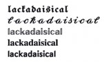
But brace yourself for some bad news: They are NOT accessible.
Assistive technologies can’t interpret them, so they often get skipped or become unintelligible sounds. They can even mess up your SEO because they’re not searchable.
So, our recommendation is to avoid them entirely.
Emojis, on the other hand, can be accessible – if you use them correctly. When translated by screen readers, emojis are read as their prescribed descriptions. So 🫢 becomes ‘face with open eyes and hand over mouth’.
For your content, this means prioritising your words and using emojis sparingly (ideally at the end of sentences) so that people using screen readers can understand the information coherently.
If you’re unsure how an emoji will be read out by an accessible device or program, you can verify its description on emojipedia.org.
B is for: Brevity
Here at RM, we’re big plain English advocates. When you write clearly, people with dyslexia and other learning difficulties can better understand what you’re trying to say.
One tip to achieve brevity? Swap nouns for verbs to put your writing in the active voice.
No one wants to read about how:
‘The implementation of the new policy resulted in the improvement of employee satisfaction’.
Instead, be clear and direct that:
‘The new policy improved employee satisfaction’.
Another quick tip? Look at your sentence topics. Are you conveying more than one key idea per sentence? If so, your content could be convoluted.
C is for: Consideration
How you talk about people is just as important (if not more) than how you talk to them.
Person-first language is when the person is emphasised, such as: ‘person with a disability’.
Identity-first language is the opposite, where the disability is focused, such as: ‘a disabled person’.
So when do we use which?
The Victorian Government recommends person-first language, but recognises that people with disabilities have their own preferences.
Ultimately, it’s important to respect these decisions when talking to or writing about specific people with disabilities. If you’re unsure, learn to ask about their preference!
D is for: Descriptive links and images
You can’t assume that everyone will immediately understand your images or links.
So instead of vague directives like ‘click here’, opt for linking specific text such as ‘read our accessibility guide’ to provide context.
Additionally, always add alt-text to describe your images.
Alt-text provides a summary of an online image’s key details. It’s critical to get into the habit of adding it to every visual you upload online.
It makes content accessible, ensuring visually impaired users or those using screen readers can understand it. As a bonus, it boosts your SEO when applied to website images. Win-win!
E is for: Empathy
Ableist language, just like sexist or racist language, is often rooted in common, casual words. These words can be offensive and alienating.
All too recently, in 2022, Lizzo and Beyoncé were criticised for using “spaz” – short for spastic, a derogatory term for people with cerebral palsy – in their songs.
Likewise, using words like ‘OCD’ when you mean ‘meticulous’ or ‘neat’, or ‘bipolar’ when you mean ‘erratic’ or ‘unreasonable’ perpetuates harmful stereotypes towards people with disabilities. And excludes them from engaging safely with your content.
Educating ourselves about ableist words and making a conscious effort to find appropriate substitutes helps ensure we’re being empathetic and inclusive.
F is for: Formatting
Formatting is especially important when writing for social media, as it can capture attention and improve readability.
Like alt text, most platforms don’t offer formatting and layout options. So it’s best practice to incorporate plenty of white space using line breaks, short paragraphs, bullet points and headings to prevent your posts looking cluttered and overwhelming.
You also need a healthy amount of punctuation.
Because if your text is lacking commas or full stops assistive devices will simply read it like a run-on paragraph and never take a breath because nothing is telling it to stop and there is no flow rhyme rhythm reason or pause to give your followers understanding of your intended structure meaning you can say goodbye to your punchy content and brand tone of voice.
(It’s also harder to read and understand… see?)
G is for: Graphic design
Can you read this text?
Unless you’re superhuman, you’re probably having a tough time reading the sentence above. (For the record, it says, ‘Can you read this text?’)
Understandably, if you’re a writer, you’ll mostly be focused on your words. But your words don’t exist in a vacuum. They are placed somewhere – whether it’s on a web page, email newsletter or blog article.
Considering the colour contrast and graphic design of the place where your words appear is the cherry on top of creating inclusive content.
If you need a personal assistant, check out Accessible Web’s Colour Contrast Checker tool. It’s super handy for making sure your brand’s colour palette and content are visually accessible.
H is for: Hashtags
Hashtags are a must for maximising your social media marketing. But did you know there are different ways you can write them to improve their accessibility?
Say hello to Title Case and Camel Case.
With Title Case, each word is capitalised at the start, like #InclusiveWriting.
With Camel Case, the first word is entirely lowercase, and the following words have an initial capital letter – as in #inclusiveWriting.
You should always use one of these styles. They allow screen readers to correctly identify the words so followers can hear #SuperBowl instead of #SuperbOwl. It also helps with clarity more generally. To use this marketing campaign in Switzerland (which has the country code CH) as an example – do you think they meant to guide readers to read #hobbitch instead of #HobbitCH?

‘I’ is for: Interested in more? Get in touch to learn how we can help you make your content marketing more inclusive.